TopPodcast.com
Menu
  • Home
  • Top Charts
  • Top Networks
  • Top Apps
  • Top Independents
  • Top Podfluencers
  • Top Picks
    • Top Business Podcasts
    • Top True Crime Podcasts
    • Top Finance Podcasts
    • Top Comedy Podcasts
    • Top Music Podcasts
    • Top Womens Podcasts
    • Top Kids Podcasts
    • Top Sports Podcasts
    • Top News Podcasts
    • Top Tech Podcasts
    • Top Crypto Podcasts
    • Top Entrepreneurial Podcasts
    • Top Fantasy Sports Podcasts
    • Top Political Podcasts
    • Top Science Podcasts
    • Top Self Help Podcasts
    • Top Sports Betting Podcasts
    • Top Stocks Podcasts
  • Podcast News
  • About Us
  • Podcast Advertising
  • Contact
Not in our directory?
Add Show Here
Podcast Equipment
Center

toppodcastlogoOur TOPPODCAST Picks

  • Comedy
  • Crypto
  • Sports
  • News
  • Politics
  • True Crime
  • Business
  • Finance

Follow Us

toppodcastlogoStay Connected

    View Top 200 Chart
    Back to Rankings Page
    Arts

    Data Stories

    A podcast on data and how it affects our lives — with Enrico Bertini and Moritz Stefaner

    Advertise

    Copyright: © 2023 Enrico Bertini and Moritz Stefaner

    • Apple Podcasts
    • Google Play
    • Spotify

    Latest Episodes:
    80 | Indexical Visualization with Dietmar Offenhuber Aug 10, 2016
    Show notes

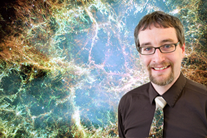
    August 28, 2013 - Dietmar Offenhuber, a new faculty member in the College of Arts, Media and Design and the College of Social Sciences and Humanities, specializes in visualization and information design.

    We have Dietmar Offenhuber, Assistant Professor at Northeastern University, on the show again to talk about “Indexical Visualizations”: visualizations that reduce the gap between the recorded phenomenon and its representation.

    In Dietmar’s words: “If we understand ‘data’ as a collection of symbolically encoded observations, could we think of a display that conveys information—without the symbolic encoding of data—through the object itself?”

    On the show we talk about strategies to define and build indexical visualizations. Dietmar provides numerous examples, including thermometers, tree rings, petri dishes, and the blinking lights in your router. He also offers tips on experimenting with this kind of visualization and connecting to the indexical vis community.

    If you enjoy this episode you may also want to listen to our previous episode with Dietmar and to our “data sculptures” episode with Domestic Data Streamers.

    Enjoy the show!

    This episode is sponsored by Tableau. Tableau helps people see and understand their data. Tableau 10 is the latest version of the company’s rapid fire, easy-to-use visual analytics software. It includes a completely refreshed design, mobile enhancements, new options for preparing, integrating and connecting to data and a host of new enterprise capabilities. You can find more information on the upcoming Tableau 10 here.

    LINKS

    • OddOne (who made our new title music)
    • Dietmar Offenhuber: http://offenhuber.net/
    • Paul Slovic’s “Psychic Numbing”
    • Example: Kamel Makhloufi’s Iraqi casualties
    • Example: Hydrogen sulfide measurement
    • Documentation from Indexical Design Symposium
    • Photoviz book from Nicolas Felton
    • Related Data Stories episodes:
      • DS 51 | Smart Cities w/ Dietmar Offenhuber
      • DS 58 | Data Installations w/ Domestic Data Streamers
    • Book chapter: Offenhuber, Dietmar, and Orkan Telhan. 2015. “Indexical Visualization—the Data-Less Information Display.” In Ubiquitous Computing, Complexity and Culture, edited by Ulrik Ekman, Jay David Bolter, Lily Diaz, Morten Søndergaard, and Maria Engberg, 288–303. New York: Routledge.
    • Other examples:
      • Standing Waves on a String
      • Bubble Chamber Representations
      • http://www.highres.factum-arte.org/Tutankhamun/
      • Pinterest’s collection of indexical visualizations
      • Hydrogen Sulfide Measurement
      • Slime Mold
      • Latent Figure Protocol

    79 | Information Design with Isabel Meirelles Jul 27, 2016
    Show notes

    Isabel Meirelles is Professor in the Faculty of Design at OCAD University in Toronto, Canada. She is the author of Design for Information, a lovely data visualization book featuring pages of beautiful illustrations and loads of data visualization science. On the show we talk about how Isabel came to write the book, how she designed its content and structure, and how it is now being used for teaching.

    We also talk about Information Plus, the data visualization conference she co-organized and took place last June in Vancouver, Canada at Emily Carr University. The conference brought together a whole host of amazing speakers and gained tons of attention from the Twitter-sphere.

    Enjoy the show!

    This episode of Data Stories is sponsored by Qlik, which allows you to explore the hidden relationships within your data that lead to meaningful insights. Any Formula 1 fans out there? Check out this Qlik Sense app which gives you the history of every race and where each competitor finished. And make sure to try out Qlik Sense for free at: qlik.de/datastories.

    http://datastori.es/wp-content/uploads/2016/07/Isabel-Meirelles-promo_v1.mp4

    Links

    Isabel Meirelles

    Isabel’s Information Design Course

    Isabel’s Book: Design for Information

    Information+ Conference

    Shneiderman’s Information Seeking Mantra

    Tamara Munzner’s Design Studies Process Model

    Gregor Aisch’s adaptation of Information Seeking Mantra to mobile screens:

    • https://twitter.com/benbendc/status/744060144926003200
    • https://twitter.com/eagereyes/status/743963279509229568

    078  |  Mimi Onuoha on Visualizing People's Lives through Mobile Data Jul 14, 2016
    Show notes

    This week Mimi Onuoha joins Moritz on the show for a project episode from the Eyeo Festival. Mimi is a Brooklyn-based artist and researcher, and currently a Fellow at the Data & Society Research Institute.

    Mimi is fascinated by the moment when data get collected — by what can be captured in that moment, and what goes unseen. As a Fulbright-National Geographic Fellow, Mimi developed Pathways, a data storytelling project on a month’s worth of mobile data from a small group of Londoners. Using a quasi-ethnographic approach, the project reflects not only the individuals’ mobile metadata, but also their experiences becoming data subjects.

    On the show, we discuss Mimi’s process recruiting both friends and strangers to become her data subjects, her experience developing personal relationships with each of them, and their reaction to the final product.

    mimi_square

    http://datastori.es/wp-content/uploads/2016/07/Mimi-Onuoha-promo.m4v

    This episode of Data Stories is sponsored by Qlik, which allows you to explore the hidden relationships within your data that lead to meaningful insights. Ever wondered what it costs to live in Singapore or Sydney? Check out the Qlik Sense app “Cost of Living” to answer that question and many others! And make sure to try out Qlik Sense for free at: qlik.de/datastories.

    LINKS

    • Fulbright-National Geographic Fellowship
    • Data and Society Research Institute
    • Open Paths app
    • Moves app owned by Facebook
    • Reveal.js slideshow software

    77 | Polygraph and The Journalist Engineer Matt Daniels Jul 01, 2016
    Show notes

    mattWe have Matt Daniels on the show, the “journalist engineer” behind Polygraph, a blog featuring beautiful journalistic pieces based on data. If you are not familiar with the site, stop now and take a look.

    Matt starts with a simple question — for example, what songs from the ’90s are still popular? — and tries to answer it through data analysis and visualization. The result is always a well-crafted web page and applications, with a mix of data analysis, interactive graphics, and explanations.

    On the show we talk specifically about two projects: “The most timeless songs of all-time,” in which Matt analyzes song popularity from Spotify data, and “Film Dialogue from 2,000 screenplays, Broken Down by Gender and Age,” in which he examines movie dialogues as a way to dig deeper into gender biases in the film industry.

    http://datastori.es/wp-content/uploads/2016/07/Matt-Daniels-promo.m4v

    This episode of Data Stories is sponsored by CartoDB. CartoDB is an open, powerful, and intuitive platform for discovering and predicting the key facts underlying the massive location data in our world. Whether you are a business, government agency, or simply a lover of revolutionary spatial insight technology, don’t settle for anything less than the best interactive maps around. Learn how CartoDB is shaping the world of location intelligence at cartodb.com/gallery and check out the Location Data Services mentioned in the ad.

    LINKS

    Matt Daniels
    Matt’s Medium article “The Journalist Engineer”
    Project: “The largest vocabulary in Hip Hop”
    Project: “How music taste evolved”
    Project: “The most timeless songs of all-time”
    Project: “Film Dialogue from 2,000 screenplays, Broken Down by Gender and Age”
    Washington Post: “Doctors fire back at bad Yelp reviews — and reveal patients’ information online” (Collaboration between Enrico’s Lab and ProPublica)

    Related episodes

    • Data Safaris w/ Benedikt Groß
    • Behind the Scenes of "What's Really Warming The World?" with the Bloomberg Team
    • Visualizing Your "Google Search History" with Lisa Charlotte Rost
    • Kim Albrecht on Untangling Tennis and the Cosmic Web
    • The Pudding with Matt Daniels

    76 | Bocoup and OpenVis Conference Jun 15, 2016
    Show notes

    bc02cc9e6126c6278bc2f8e0f4aa8ea491a6b6635db6e086bf785a1a49ab83f1 10a8752541d23e5071df0eb9b40d271d

    On the show this week we have Irene Ros, Jim Vallandingham, and Yannick Assogba from the data visualization team of Bocoup. We talk about how they collaborate with other groups to create open-source data visualization software. We also talk about OpenVis Conference, the successful and innovative visualization event they organize each year, as well as the cool visualization projects they develop internally.

    This episode of Data Stories is sponsored by CartoDB. CartoDB is an open, powerful, and intuitive platform for discovering and predicting the key facts underlying the massive location data in our world. Whether you are a business, government agency, or simply a lover of revolutionary spatial insight technology, don’t settle for anything less than the best interactive maps around. Learn how CartoDB is shaping the world of location intelligence at cartodb.com/gallery.

    LINKS
    Irene Ros
    Jim Vallandingham
    Yannick Assogba
    Voyager (Exploratory Visualization Tool from IDL)
    Lyra (Chart Building Tool from IDL)
    Bocoup’s self-commissioned project “Stereotropes”
    Bocoup’s educational initiatives
    OpenVis Conference 2015
    OpenVis Conference Video Archive
    OpenVis Conference file of transcripts
    Contact the OpenVis Conference team
    Lisa Charlotte Rost’s blog posts “One Chart, Twelve Tools” and “One Chart, Twelve Charting Libraries”

    Related episodes

    • Jeff Heer on Merging Industry and Research with the Interactive Data Lab
    • Information+ Conference Review

    75 | Listening to Data From Space with Scott Hughes Jun 01, 2016
    Show notes

    SCOTT_HUGHES_2

    Dear friends, we are really excited to publish our first “data sonification” episode ever! After many years of searching for the right person, subject and format, we are happy to publish this fantastic episode with Scott Hughes from MIT. Scott is an astrophysicist and a key figure at LIGO, the laser interferometer project that finally allowed scientists to “listen” to the sound of two colliding black holes.

    Here Scott talks about how he decided to sonify his data and how sonification is being used by scientists to understand astrophysical phenomena.

    Listen as we play a number of samples; Scott walks us through their meaning and the physics behind them. It’s really really cool. Warm up your ears!

    You can also listen to some samples from Scott Hughes and his team here:

    • Simulation of two black holes orbiting each other. They gradually spiral together. As they move closer, the waves sweep up in frequency and amplitude, producing the “chirp.”
    • Simulation of a final collision of two massive black holes, what Scott calls “the ringing mode” of a black hole. All that is audible is the last “pop” of the system settling down to a single black hole.http://datastori.es/wp-content/uploads/2016/06/m100.mp3
    • Two objects moving past each other in space. The gravitational waves in this case are loud when the small body moves close to the large body (its motion is fast during that part of the orbit), and they are quiet when the small body is far away (when its motion is slow).http://datastori.es/wp-content/uploads/2016/06/e0.95_i20.wav
    • Also, take a look at the many links that we have added below. You can listen to the sounds yourself and discover a number of additional sonification projects.

    Huge thanks to Scott for spending so much time with us preparing the sounds and recording the show. We loved it!

    http://datastori.es/wp-content/uploads/2016/05/Scott-Hughes-promo.m4v

    This episode of Data Stories is sponsored by CartoDB. CartoDB is an open, powerful, and intuitive platform for discovering and predicting the key facts underlying the massive location data in our world. Whether you are a business, government agency, or simply a lover of revolutionary spatial insight technology, don’t settle for anything less than the best interactive maps around. Learn how CartoDB is shaping the world of location intelligence at cartodb.com/gallery.

    LINKS

    • Scott’s website
    • Scott’s group’s web archive of sound files and discussion
    • The Atlantic on Scott’s work: What Gravitational Waves Sound Like
    • Video of the LIGO Gravitational Wave Chirp
    • The LIGO site (Laser Interferometer Gravitational-Wave Observatory)
    • The LIGO Scientific Collaboration
    • Soundcloud of LIGO Gravitational Waves Announcement Chirp
    • Catalog of example sonifications of gravitational wave signals
    • Listen to Wikipedia project
    • The New York Times’s Fractions of a Second: An Olympic Musical
    • NPR’s U.S. Home Prices, Sung as Opera
    • Medium on What Does Data Sound Like?
    • Youtube video of what different sorting algorithms sound like

    Related episodes

    • Data Visualization Accessibility with Sarah Fossheim

    074  |  Data Ethics and Privacy with Eleanor Saitta May 18, 2016
    Show notes

    saitta-headshot-2014-front-color-683x1024

    We have Eleanor Saitta on the show to talk about data privacy. Eleanor is “a hacker, designer, artist, writer, and barbarian.” She is also Etsy’s new Security Architect.

    During our chat we discuss the fine line between the excitement of being able to work with great data sets and the many — oftentimes unexpected — privacy risks associated with it.

    http://datastori.es/wp-content/uploads/2016/05/Eleanor-Saitta-promo_v2-1.m4v

    This episode of Data Stories is sponsored by Qlik, which allows you to explore the hidden relationships within your data that lead to meaningful insights. Make sure to check out the data visualization mapping tutorial on the Qlik Blog. You can try out Qlik Sense for free at: qlik.de/datastories.

    LINKS

    • Eleanor Saitta
    • Journal of Spatial Science: “Tagging Banksy: using geographic profiling to identify a modern art mystery”
    • More on Banksy: “Mystery Solved? Scientists Reveal Banksy’s Identity” and “These researchers tracked Banksy like a serial killer to reveal his identity”
    • Medium: “Deanonymizing BuzzFeed’s Tennis Exposé”
    • The Atlantic: “When Fitbit Is the Expert Witness”
    • Connecting Grassroots and Government for Disaster Response: when choosing between privacy and control, there’s no easy answer
    • From Columbia University: “Location Data on Two Apps Enough to Identify Someone, Says Study“
    • W&L Law Review: “Elements of a New Ethical Framework for Big Data Research”
    • Markets for Good: “The Trials and Tribulations of Data Visualization for Good”

    Related episodes

    • Big Data Skepticism w/ Kate Crawford
    • Calling Bullshit with Carl Bergstrom and Jevin West

    073  |  Kim Albrecht on Untangling Tennis and the Cosmic Web May 04, 2016
    Show notes

    Kim is a visualization researcher and information designer. He currently works at the Center for Complex Network Research, the lab led by famous network physicist László Barabási.

    Kim works in a team of scientists to create effective and beautiful visualizations that explain complex scientific phenomena.

    In the show we focus on Untangling Tennis, a data visualization project aimed at explaining the relationship between popularity and athletic performance. We also talk about his more recent project, the Cosmic Web, which visualizes 24,000 galaxies and their network of gravitational relationships.

    Enjoy the show!

    http://datastori.es/wp-content/uploads/2016/05/Kim-Albrecht-Promo-final.m4v

    This episode of Data Stories is sponsored by Qlik, which allows you to explore the hidden relationships within your data that lead to meaningful insights. Make sure to check out the blog post listing Visualization Advocate Patrik Lundblad’s favorite data visualization pioneers. You can try out Qlik Sense for free at qlik.de/datastories.

    LINKS

    • Kim Albrecht
    • Untangling Tennis
    • The Cosmic Web
    • D3.js
    • three.js, a javascript library for 3D vis
    • Ben Shneiderman’s The New ABC of Research
    • Peter Galison‘s Image and Logic
    • Peter Galison’s “Images Scatter Into Data, Data Gathers Into Images”

    Related episodes

    • Science Communication at SciAm w/ Jen Christiansen
    • Polygraph and The Journalist Engineer Matt Daniels

    072  |  Jeff Heer on Merging Industry and Research with the Interactive Data Lab Apr 20, 2016
    Show notes

    Jeff Heer is Associate Professor at the University of Washington where he leads the Interactive Data Lab (IDL). Jeff has worked on many visualization libraries and software programs, including Prefuse, Flare, Protovis and the widely adopted D3 (with his former PhD student Mike Bostock). Jeff is also the co-founder of Trifacta, a data analytics company focused on data wrangling.

    On the show we talk about many interesting research tools and products developed in Jeff’s lab, including Vega, Voyager and Lyra. We also talk about Trifacta and the challenges and promises of visualization research.

    Enjoy the show!

    Data Stories is brought to you by Qlik, which allows you to explore the hidden relationships within your data that lead to meaningful insights. Let your instincts lead the way to create personalized visualizations and dynamic dashboards with Qlik Sense, which you can download for free at www.qlik.de/datastories. Make sure to check out their post on truth & beauty (!) at the Qlik blog.

    Related episodes

    • Bocoup and OpenVis Conference
    • Challenges of Being a Vis Professional in Industry with Elijah Meeks

    71 | Tapestry Conference Review with Robert Kosara Apr 06, 2016
    Show notes

    Hey guys, this is a special edition from Tapestry, the conference on Data Storytelling that brings together visualization experts, journalists, designers, NGOs, academics, and more.

    Enrico sits down with Robert Kosara to recap the conference, especially the keynotes and some of the short story talks. Plus, Robert fills us in on how to participate in Tapestry conferences in the future.

    Enjoy the show!

    Links

    • Scott Klein
    • Jessica Hullman
    • Nick Sousanis
    • Catherine Madden
    • Alan Smith
    • Eva Galanes-Rosenbaum
    • RevEx (Review Explorer) – Tool from Enrico’s lab
    • Tapestry YouTube Channel

    The transcript for this episode is available here.

    Data Stories is brought to you by Qlik, which allows you to explore the hidden relationships within your data that lead to meaningful insights. Download Qlik Sense for free at http://www.qlik.de/datastories. For all Quantified Selfers, a senior member of Qlik’s Demo Team, Michael Anthony, has published his 2015 “My Life In Data” Report, where he tracks life events including miles run, coffees consumed, commuting mileage, food eaten and more!

    Presentations


    Previous 1 8 9 10 11 12 17 Next

    Related Podcasts

    Fresh Air

    1

    Fresh Air Arts
    Twenty Thousand Hertz

    2

    Twenty Thousand Hertz Arts
    The Black Tapes

    3

    The Black Tapes Arts
    Snap Judgment

    4

    Snap Judgment Arts
    Here’s The Thing with Alec Baldwin

    5

    Here’s The Thing with Alec Baldwin Arts
    The NoSleep Podcast – Creative Reason Media Inc.

    6

    The NoSleep Podcast – Creative Reason Media Inc. Arts
    footer-logo

    Contact Us

    Toll Free: 844-670-7747

    Links

    • Home
    • Top Charts
    • Networks
    • Apps
    • Independents Podcasts
    • Podcast Advertising
    • Podcast News
    • Contact Us
    • About Us
    • Analytics & Insights

    Stay Connected

      Privacy, Terms of Use & Our Code of Ethics Protecting Content Creators Copyrights